Email marketing has extremely high returns on investment (ROI), about $3 for every $1. No doubt about that.
But just like any marketing channel, there are a few challenges to scale before you can get good results.
For email marketing, the main challenge is peaking subscribers’ interests in your emails and ensuring they click through everytime you send them one.
Your subscribers are already bugged with hundreds of emails, so it’s possible they treat yours like others—generic emails.
If you want to stand out, boost open-rate, and increase click-through rate, then your best bet is investing in good email designs.
In this article, I will review some of the 7 best email design trends in 2024 you can implement right away.
1. Retro Designs
Retro means adopting styles from as early as the 50s or anywhere at the start of your generation. For GenZs, that would be before the late 90s or early 2000s. Millennials have theirs in the 80s.
As you have guessed, Retro Designs are backward, ot in vogue, and no longer the flashy go-to designs people would love to include in their magazines.
But for emails, these types of designs can surely work magic.
You see, we’re caught up in the era of microtrends due to social media buzzes and the internet. Our preferences are rapidly volatile, and now, designs that could have otherwise lasted years only last a few weeks before they lose public favor.
However, humans are also fond of cherishing the past – old memories, previous architectural sights that no longer exist, the 90s pajamas we wore growing up, and Michael Jackson’s portraits with glorified neon lights or kamikaze bold typography.
One word: Nostalgic.
If you’re working with a millennial email audience, you can use this method to evoke some sense of nostalgia and help them see your brand emails as something UNIQUELY traditional yet modern.
Check out this email from Urban Outfitters.
Here are some tips to go retro with your emails:
- Use muted or pastel colors typical of vintage designs.
- Select fonts reminiscent of the past, such as typewriter or art deco styles.
- Use subtle textures like grain or paper to give a vintage feel.
- Integrate retro icons or illustrations to enhance the nostalgic look.
- Keep the design simple and clean, focusing on key elements.
- Include old photographs, posters, or advertisements.
- Ensure your retro design aligns with your overall brand identity.
- Style your headers, buttons, and dividers with a retro twist
Most importantly, keep your retro design genuine. Vintage is lovely, but overdoing it can lead to a drop in email engagement.
2. Minimalistic Themes
The idea of “less is more” came significantly from Japanese designers during World War 1 and has since evolved through time to birth game-changing designs in different marketing areas. Talk about minimalism in email, social, and content marketing
Minimalist designs refer to using fewer elements—texts, icons, colors, sections, typography, images—in your email designs. That means sacrificing a large portion of your emails, leaving only the most vital ones behind.
In one sense, minimalism aims to reduce design clutter while making more impact with fewer lines and passing your message succinctly.
Why does it work?
Well, we have an extremely short attention span. Speaking for myself, I can only dedicate as much as 45 seconds to anything before getting distracted by an innovative thought or two. The daily life of an entrepreneur, sigh 🙂
Yours could be shorter or longer.
Whichever one it is, minimalist designs reduce the number of things you need to take in when reading an email. And you get the point in less than 30 seconds—fair trade of time and value for me.
There are also fewer distractions from sparkle-sparkle header colors and bubbly CTAs (all of which are naturally nice if used well).
Check out this sample from Beefree.
Follow these tips to create awesome minimalist email designs:
- Use a clean, uncluttered layout with plenty of white space.
- Stick to one or two neutral colors with a single accent color for emphasis.
- Choose easy-to-read fonts like Arial, Helvetica, or Sans-Serif.
- Only include essential images. Ensure they are high quality and relevant.
- Use a single, prominent call-to-action button.
- Keep your text concise. Use bullet points for clarity.
- Preview your email on different devices to ensure it looks good everywhere
By the way, less is not always more. You need to find the right balance between your designs and the recipients. For instance, GenZ audiences are more likely to opt for minimalist emails than millennials.
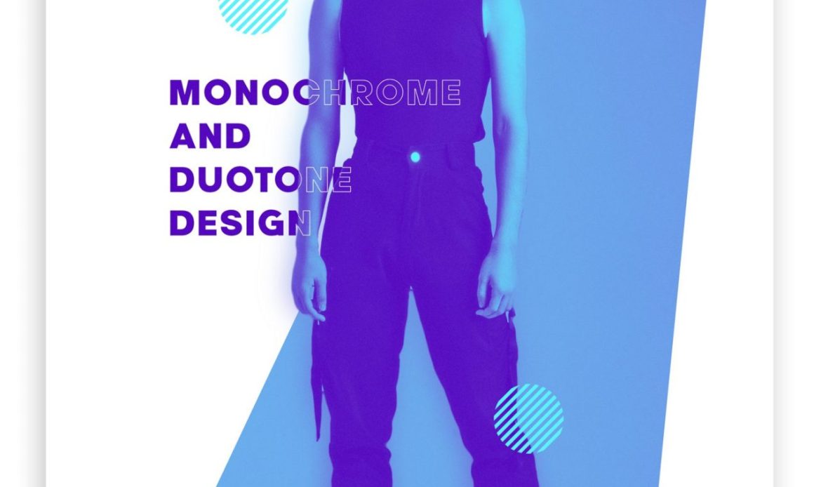
3. Monochromatic And Duotone Color Scheme
Mono- means one, while -Chromatic means the hue and saturation of a color. So, monochromatic refers to using varying hues or lightness and saturations of a single color to create a design.
For instance, Blue is a single color. But there are tons of variations, such as Navy Blue, Midnight Blue, Dark Blue, Slate Blue, Steel Blue, Cadet Blue, Sky Blue, Baby Blue, and Powder Blue. By combining two or more of these, you can create an email design without using any other color.
Similar to monochromes, Duotone designs prioritize limited use of color palettes. However, the latter uses two distinct colors, no more or less than that. Perfect fit for minimalist or retro designs, depending on your audience.
So, why are these two trending?
Monochromatic-duotone style offers simplicity and harmony. For fashion brands looking to showcase their products in a refined and elegant look that communicates sophistication and style, this is a game-changer.
See what Zekagraphic did below.
Follow these tips to design an attention-grabbing monochromatic/duotone email template:
- Stick to one or two colors to maintain clarity and visual appeal.
- Ensure there’s enough contrast between elements for readability and engagement.
- Use consistent color schemes across all email elements for a cohesive look.
- Emphasize typography to add depth and interest to your design within the limited color palette.
- Use white space strategically to balance the design and prevent it from feeling cluttered.
- Make your call-to-action buttons stand out by using a contrasting color or a different shade within your chosen palette.
- Ensure your design choices don’t hinder accessibility, especially for users with color vision deficiencies.
- Don’t be afraid to experiment with different shades and combinations to find what works best for your brand and audience.
Of course, you should track the performance of your monochromatic and duotone email designs to see what resonates best with your subscribers and adjust accordingly.
NB: Black, white, and gray colors are achromatic.
4. Dark Mode Designs
We’ve all come across Dark mode designs whether on webpages, mobile devices, or applications before—typical dark background and white or light-gray texts. Two words to qualify: Super Cool!
If there’s one thing we can all agree to, that would be the fact that this design model offers the simplest yet highly effective method to boost open-rate and CTR by:
- Adding a natural elegance and classic feel to emails (even if it sounds like trash).
- Enhancing readability due to legible contrasting.
- Saving battery life on OLED screens.
And for someone like me who spends tens of hours on screen daily, that’s a huge lifesaver. I mean eyesaver. Less straining and visual fatigue.
A report from EmailUplers also showed that 91.8% of people will switch to Dark Mode whenever available.
Moreover, several Email Service Providers are beginning to recommend Dark Mode to users due concerns on visual strain caused by long time on screen. The likes of Gmail ask you upfront when opening an account for the first time.
So, it’s a trend worth hopping on.
Check out what Bellroy did below.
Here are a few things to keep in mind when using dark-mode email designs:
- Use light text colors on dark backgrounds for readability.
- Ensure images have transparent backgrounds or dark-mode-friendly versions to avoid harsh contrasts.
- Provide alternative versions of logos and icons to ensure they are visible against dark backgrounds.
- Use lighter shades for borders and dividers to maintain visual separation without being too stark.
- Test emails in both dark and light modes across various devices and email clients to ensure compatibility and readability.
- Lastly, maintain high contrast between text and background to ensure readability for all users.
Time-limited offer: I have dozens of pre-designed and customizable dark mode templates you’d love. Reach out for a free copy if you need one.
5. Illustrations And Animations
Visuals are awesome. Illustrative visuals are even more awesome. Wanna know why?
Out of the 160+ emails an average user receives daily, about 90% of them are lines of clumped words arranged in four-sentence paragraphs. That’s enough red flags to get your emails kicked inside the spam box or cause your recipients to simply unsubscribe.
See what I’m talking about below.
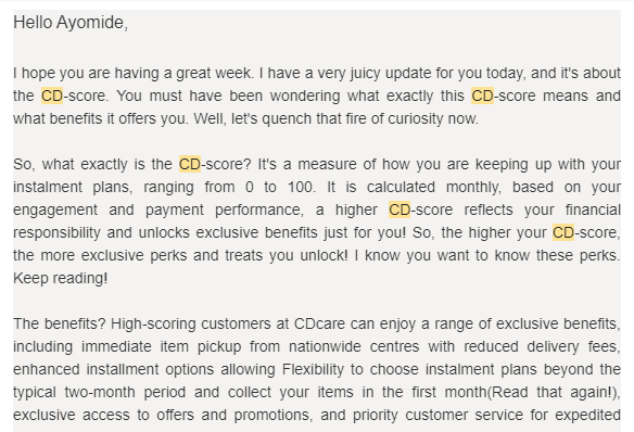
Source: Email from CDcare
CDcare, a reseller brand that offers installmental payments for products, primarily wanted its email recipients to know about CD-score, which is similar to a credit score for banks and loan apps.
However, the explanation is cluttered and inappropriately represented. The message is also not straightforward, segmented, or visually attractive, so it won’t be surprising if CDcare records low engagement for this particular email.
Alternatively, illustrative visuals could have been used to portray the whole saga. This includes using a chart to depict the growing user scores, factors that affect them, the percentage minimum to achieve, and so on.
See how Grammarly did it below.
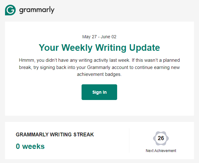
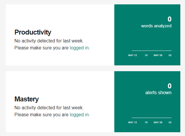
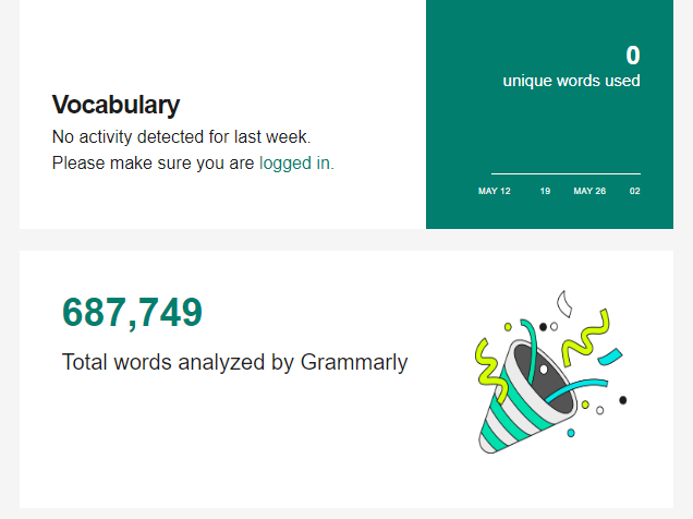
Grammarly made it easy to track my productivity by visually representing statistical data. It is easy to read, succinct, and attractive.
Here’s what to keep in mind when creating illustrative emails for your brand:
- Ensure the illustration matches the email content.
- Use high-resolution images and geometric shapes where necessary.
- Include statistical charts for quantifiable messages.
- Keep designs clean and uncluttered.
- Optimize file size for quick loading.
- Maintain consistent brand colors and style.
- Position illustrations to enhance readability.
- Preview emails across devices and email clients.
If you are using artwork or images that are not yours, ensure they are licensed for commercial use.
6. Product Carousel Designs
Email carousel designs are simply interactive email elements that allow multiple pieces of content to be displayed within a single email in a slideshow-like format. While this style of design is not as trendy as minimalist and retro themes, brands that are into paid email marketing ads or e-commerce businesses can use it to scale their sales.
Why does it work?
About 75% of the 1.5 billion Gmail users access their email accounts using smartphones. The bad news is that mobile horizontal space is limited, and vertical space is premium. If you have many products to showcase and you don’t want to make your emails look eerily long, converting them into carousels saves the day.
Besides, most carousel templates act as snippets and display content even before subscribers click.
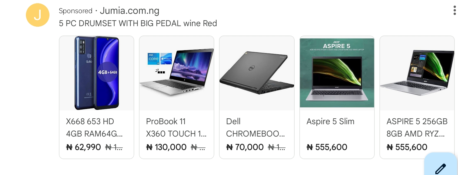
See how Jumia used carousels for its paid ads below.
Follow these tips to create awesome email carousel designs:
- Use crisp, high-resolution images to make a strong visual impact.
- Ensure the transitions between slides are smooth and quick to maintain a seamless user experience.
- Include clear navigation buttons or indicators to help users move through the carousel easily.Keep the text on each slide short and to the point. Use captivating headlines and brief descriptions to convey your message quickly.
- Optimize your carousel for mobile devices, ensuring it looks and functions well on smaller screens.
- Add compelling calls to action on each slide to drive engagement and conversions.
- Test your email across different devices and email clients to ensure the carousel functions correctly and looks great everywhere.
Note that not all email clients—Outlook, Yahoo, and Gmail—render carousel codes for emails. So, you have to ensure that the majority of your subscribers are using a client that fits in.
7. Email Hover-Effects
Hover effects are nothing new if you surf the internet all day long. The dark gray CTA that turns light gray, and the seemingly static menu that goes dynamic with a right swipe once your cursor goes over them. Cool, right?
If used well, such lifelike effects can add interactiveness to your emails and improve subscribers’ scroll-through experience.
See what Litmus did below.
As usual, follow these tips to create awesome hover-effects for your emails:
- Apply hover effects sparingly to avoid clutter.
- Use subtle changes like color shifts or underlines.
- Ensure effects are noticeable for users with disabilities.
- Provide static alternatives for non-supporting email clients.
- Check effects across various email clients and devices
Finally, ensure the hover effects don’t disrupt mobile usability. Otherwise, your engagements might take a nosedive.
Conclusion
Your email content matters, but how you present it matters even more. Even if you feature Joe Biden or Rihanna in your monthly newsletter, getting your audience to read all through will be a hard nut to crack if your designs are average.
For a good head start, explore the seven design trends I shared above and see which one generates maximum engagement from your audience. You can also conduct an open-ended or closed-ended survey to ask your subscribers for their preferred email design.
Let’s assume you’re stuck somewhere in between. That’s no problem. Schedule a brief coffee time with me below to secure a free email audit and see how we can scale up your email designs with our result-proven email marketing design services.